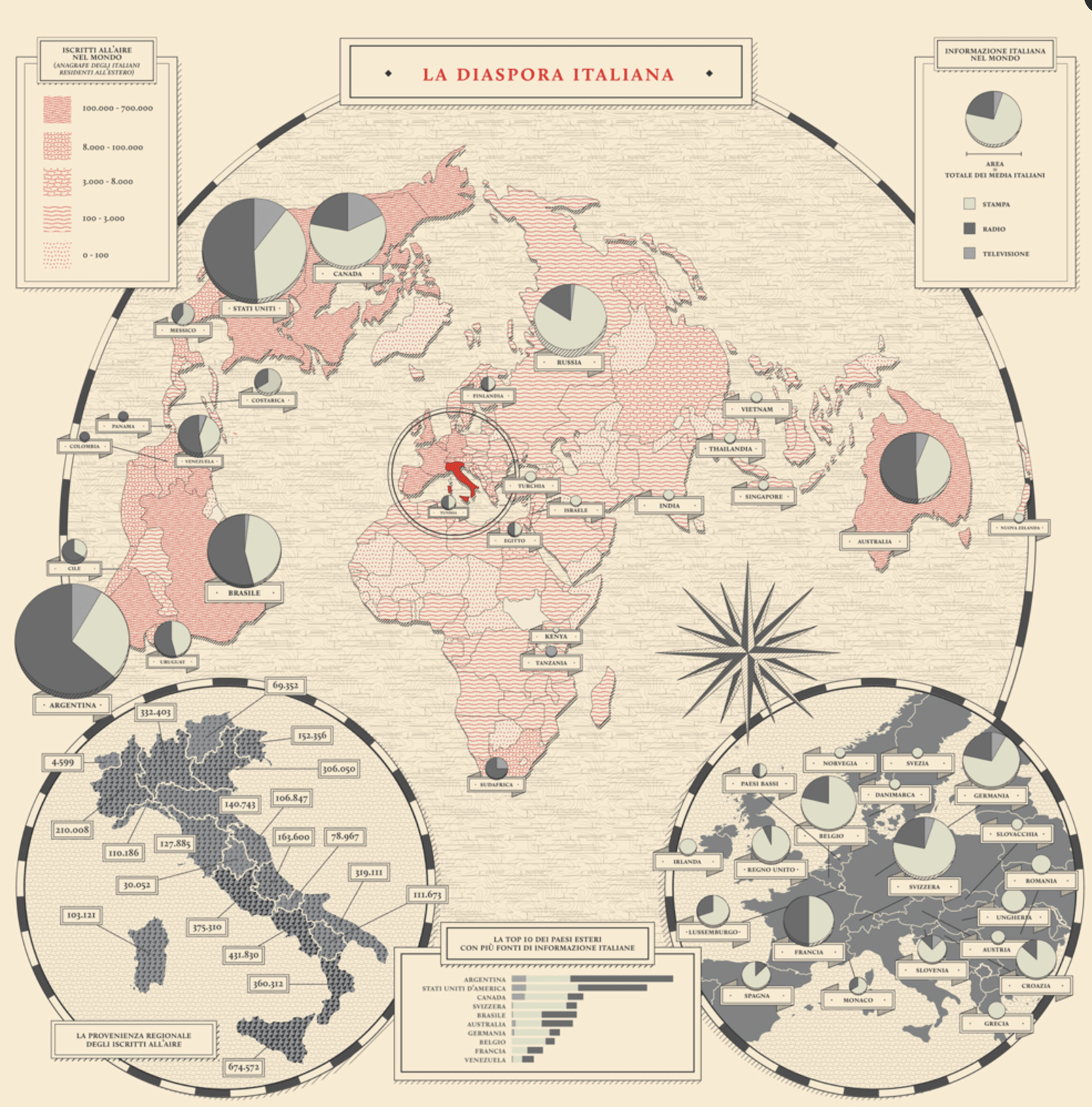
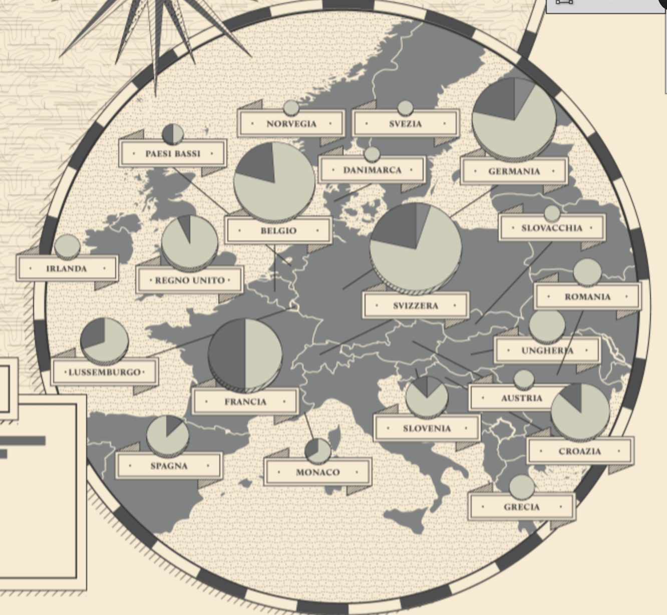
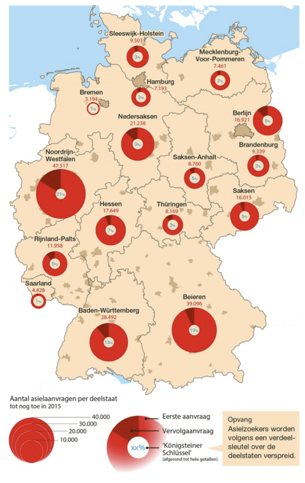
Pie Chart on a Map
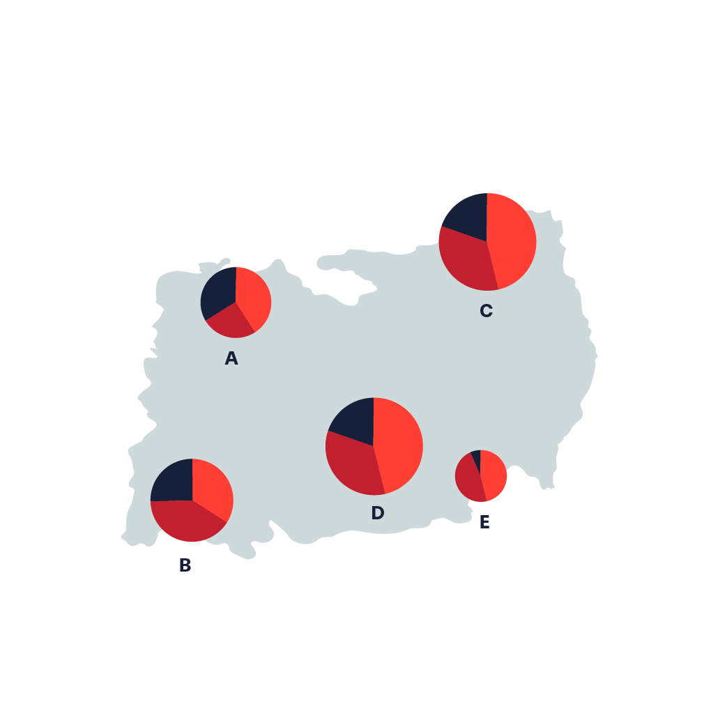
A Pie Chart Map is simply a combination of a Pie Chart data visualization and a map. It is used to visualize location and numerical proportion in a simple way. Sometimes you will see a combination of both Pie Chart, Map and Bubble Chart. Where the size of the Pie Chart circle allows one more dimension to the visualization.