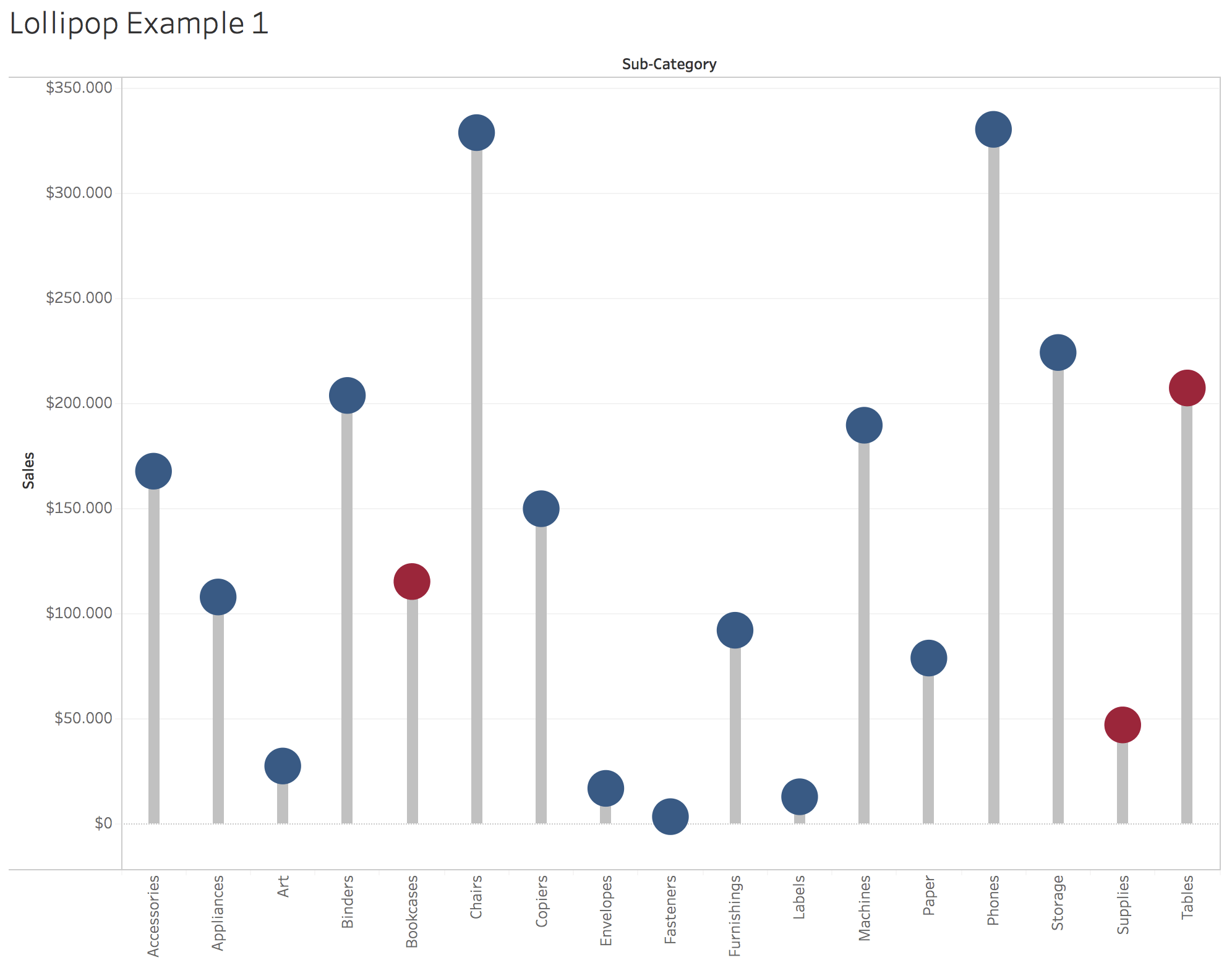
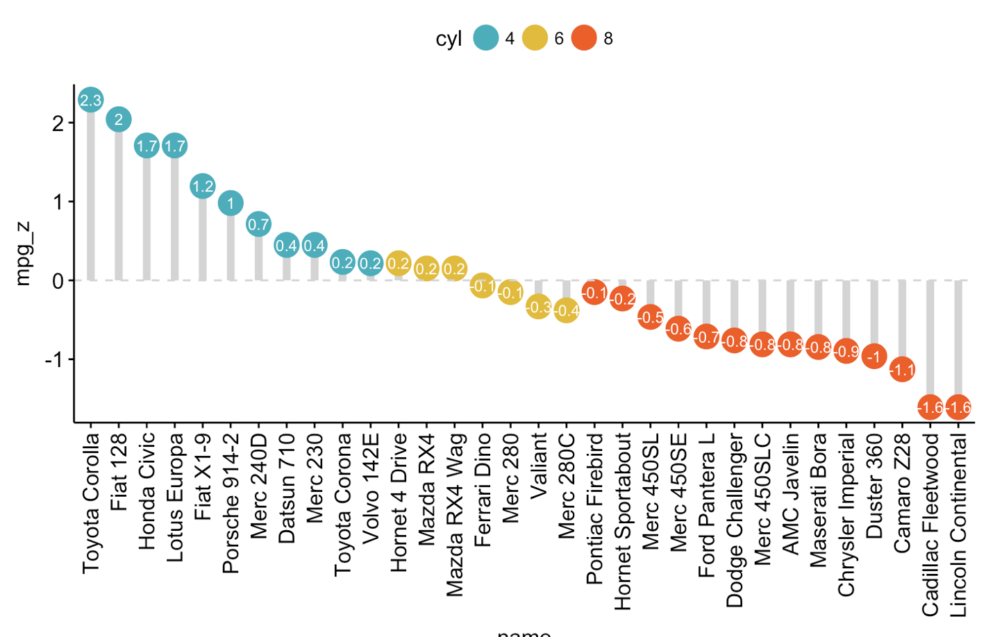
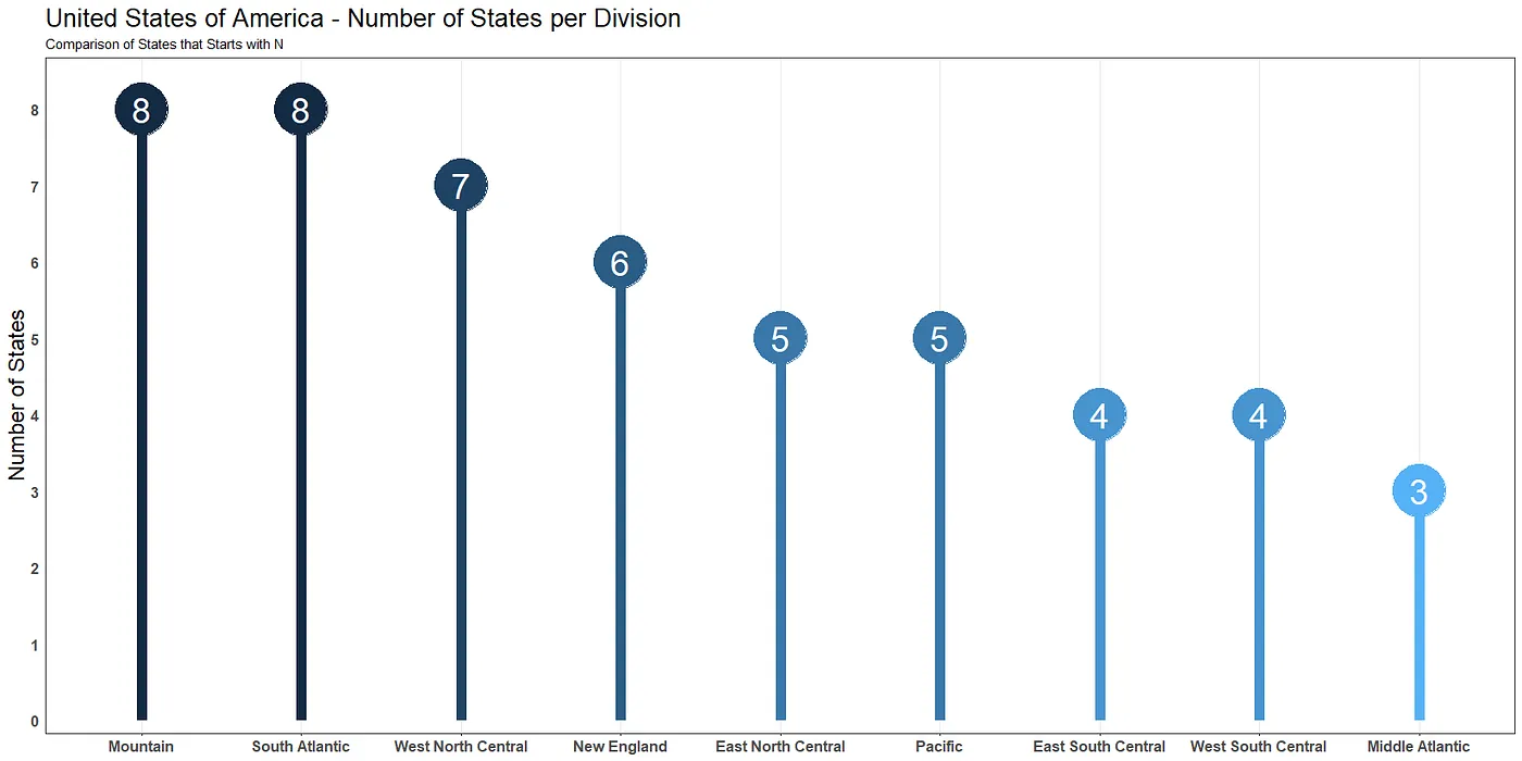
Lollipop Chart
Also called: Lollipop Plot
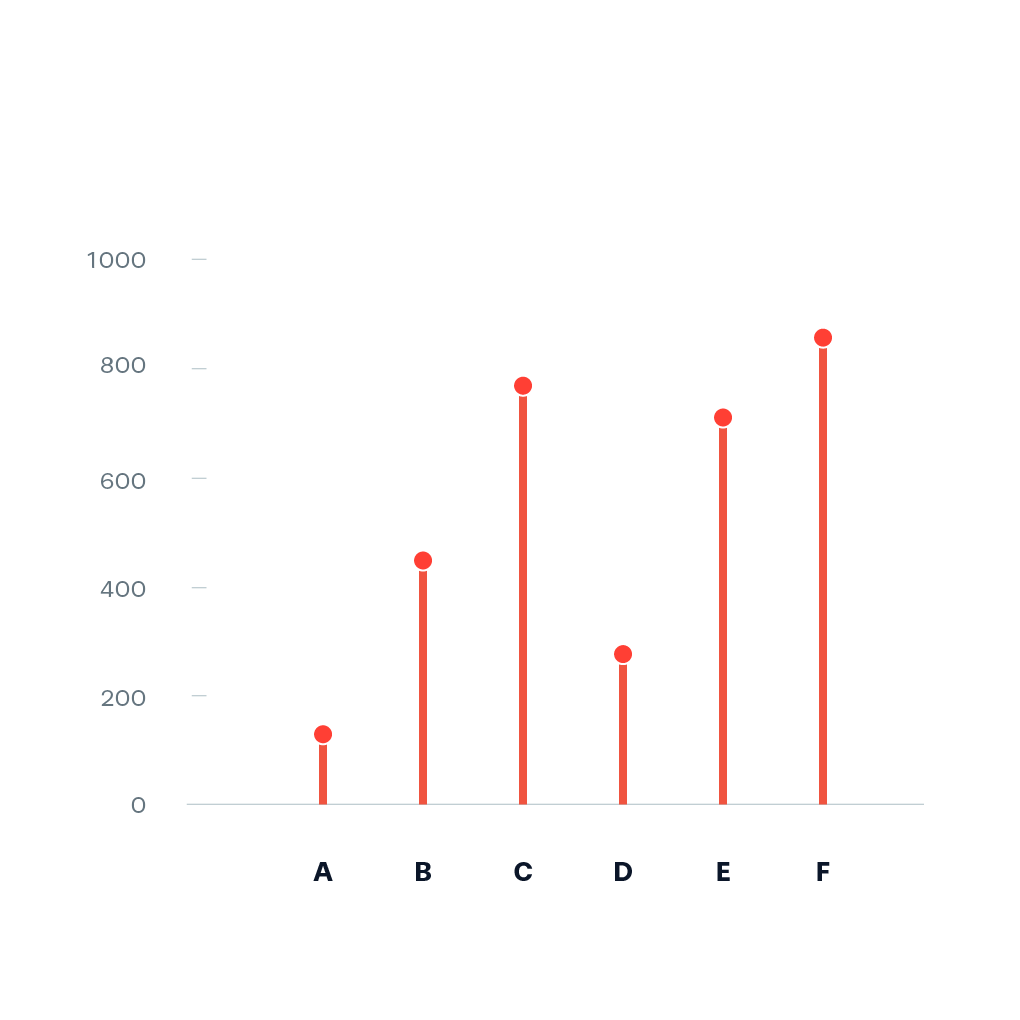
In function it is identical to a normal bar chart. But visually it consists of a line anchored from the x axis and a dot at the end to mark the value. The lollipop chart is often claimed to be useful compared to a normal bar chart, if you are dealing with a large number of values and when the values are all high, such as in the 80-90% range (out of 100%). Then a large set of tall columns can be visually aggressive.
The chart also has some less fortunate features: the centre of the circle at the end of the lollipop marks the value, but the location of the centre is difficult to judge, making it imprecise compared to the straight edge of a bar, and half of the circle extends beyond the value that it represents, making it inaccurate.
Related chart types include the dumbbell plot that focuses on the span between two values by highlighting the difference, the diverging lollipop chart that shows divergence from a particular value, and the dot chart that does not have lines.