Heat Map
Also called: Heat Table, Density Table, heat map
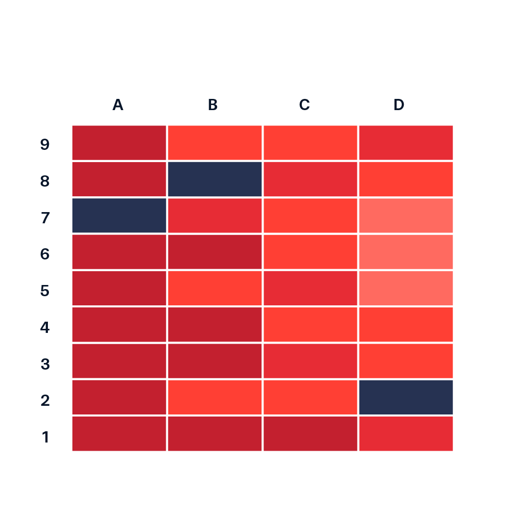
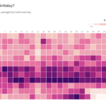
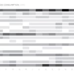
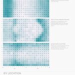
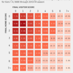
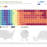
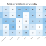
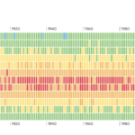
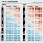
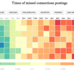
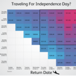
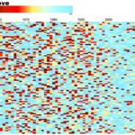
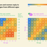
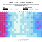
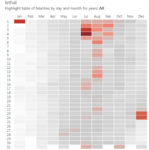
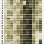
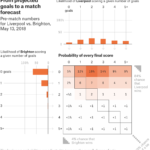
A heat map is a data visualization type where the individual values contained in a matrix through variations in coloring. The term “Heat map” was originally introduced by software designer Cormac Kinney in 1991 to describe a 2D display depicting real time financial market information even though similar visualizations have existed for over a century.
Heat maps are useful for visualizing variance across multiple variables to display patterns in correlations
Fractal maps and tree maps both often use a similar system of color-coding to represent the values taken by a variable in a hierarchy. The term is also used to mean its thematic application as a choropleth map.
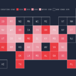
Many also incorrectly refers to heat maps as Choropleth maps – properly because of the misleading term ‘map’. But a choropleth maps include different shading or patterns within geographic boundaries to show the proportion of a variable of interest, whereas the coloration a heat map does not correspond to geographic boundaries.


