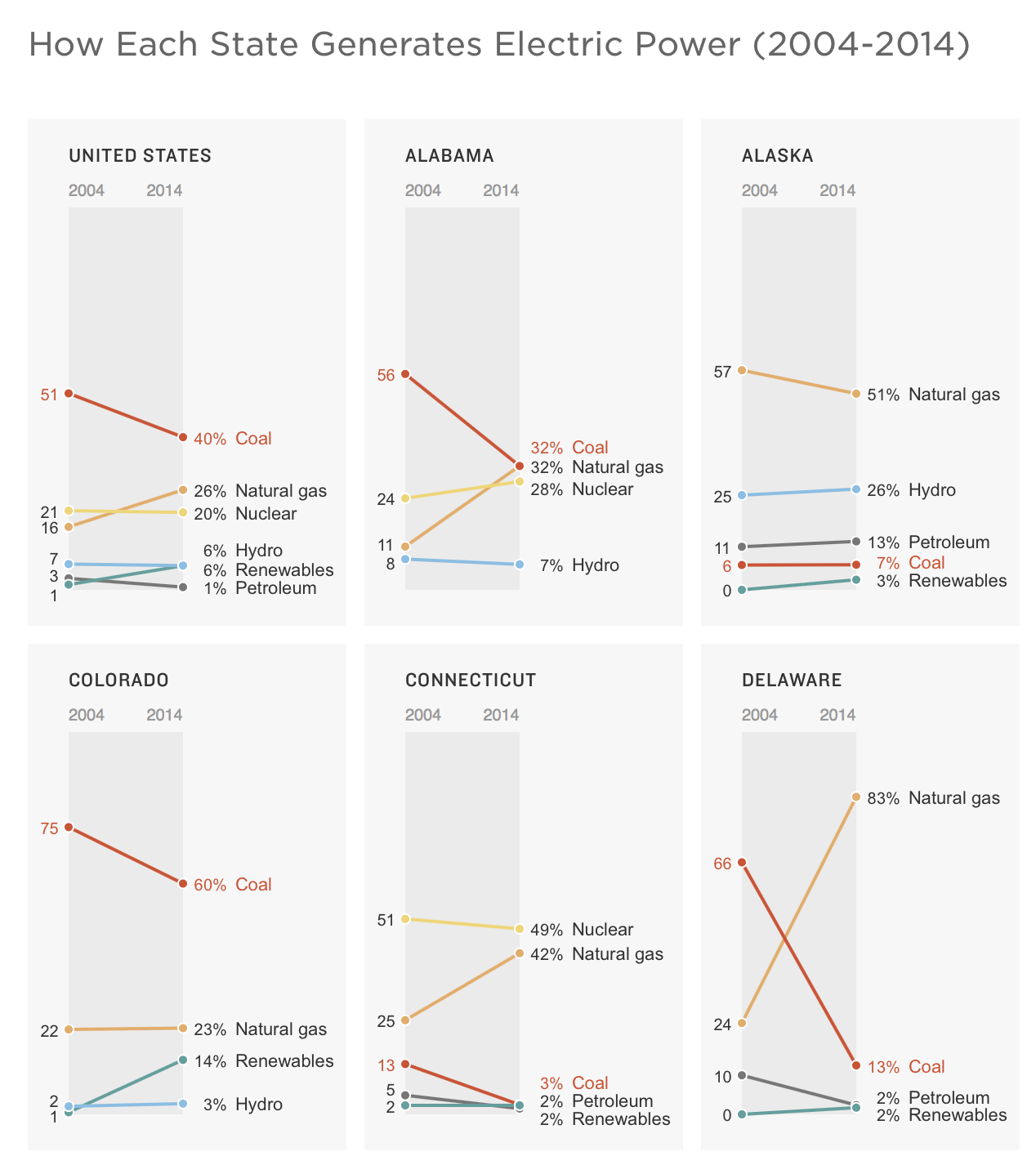
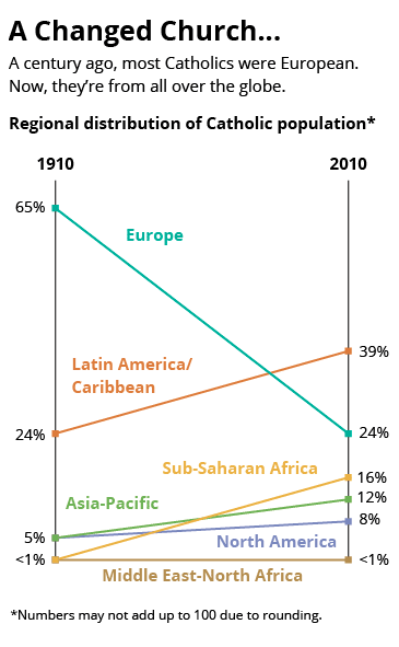
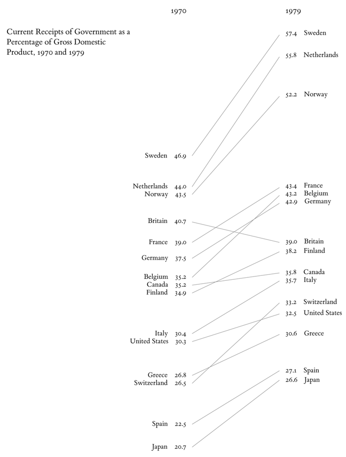
Slope Chart
Also called: Slopegraphs
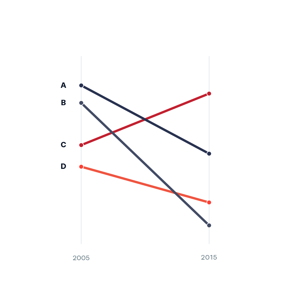
The line chart’s fraternal twin. Line charts display three or more points in time while slope charts display exactly two points in time.
Defined by Edward Tufte in his 1983 book The Visual Display of Quantitative Information, this type of chart is useful for seeing (referred to the first example below):
- the hierarchy of the countries in both 1970 and 1979 [the order of the countries]
- the specific numbers associated with each country in each of those years [the data value next to their names]
- how each country’s numbers changed over time [each country’s slope]
- how each country’s rate of change compares to the other countries’ rates of change [the slopes compared with one another]
- any notable deviations in the general trend (notice Britain in the above example) [aberrant slopes]