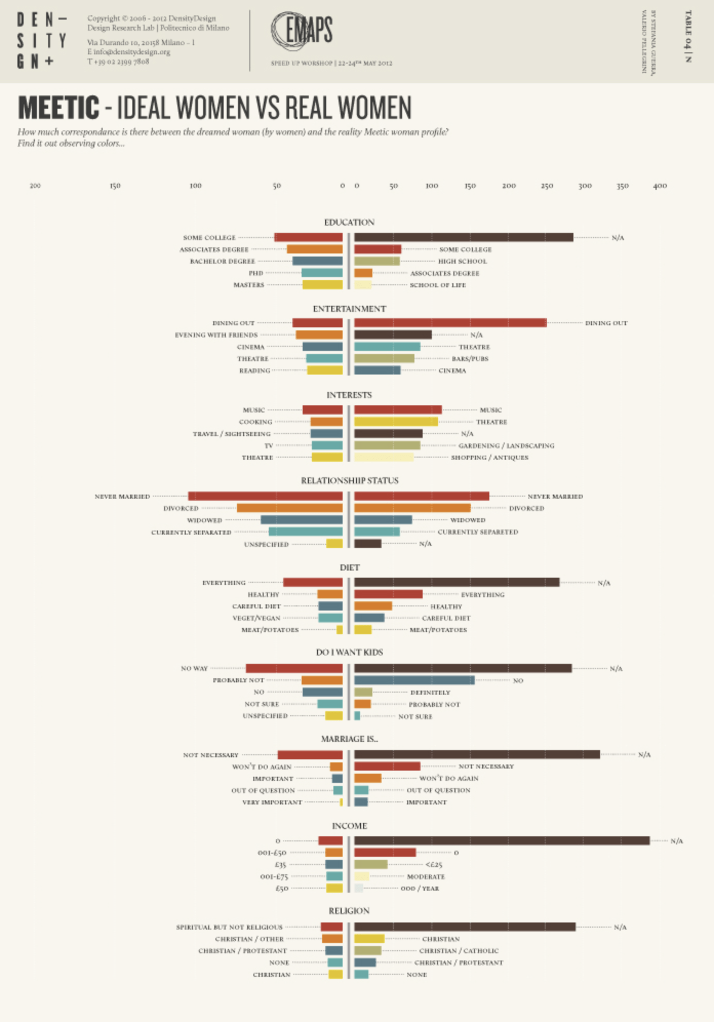
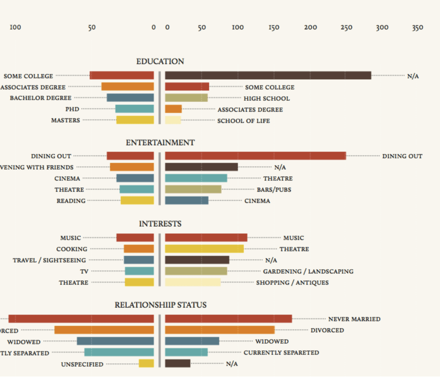
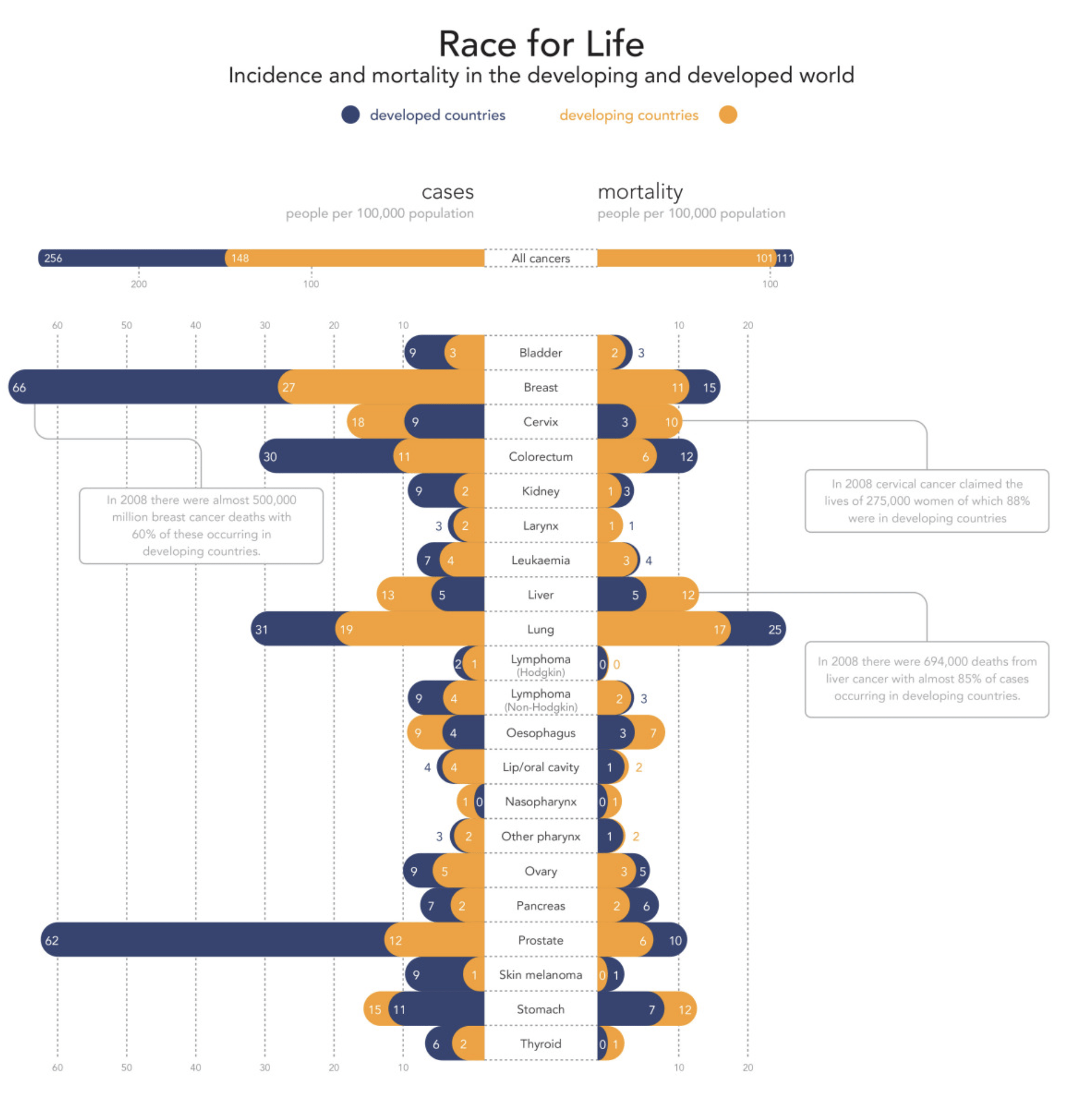
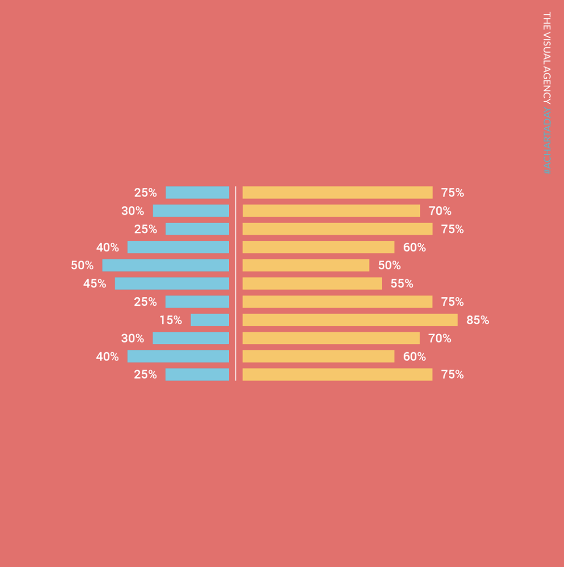
Butterfly Chart
Also called: Tornado Chart, Tornado diagram
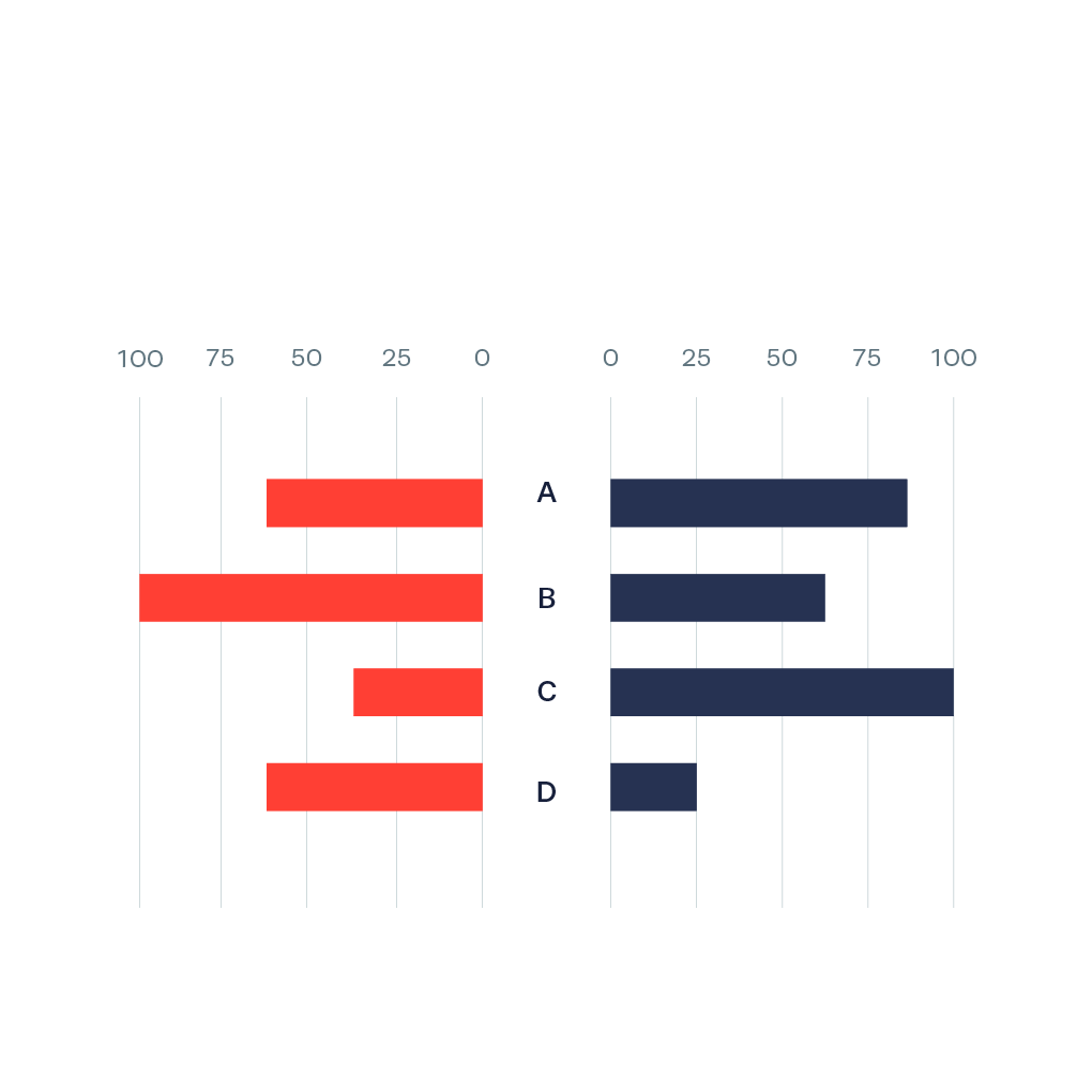
A Butterfly Chart (also called Tornado Chart) is a type of bar chart where two sets of data series are displayed side by side. It gives a quick glance of the difference between two groups with same parameters. It is also possible to stack/place two bars on each side (for example, ‘developed countries’ and ‘developing countries’) to give a further division of categories.
The main use of the butterfly chart is comparison of two data sets sharing the same parameters.
It has a lot of similarity with the population pyramid, but where the population pyramid is only for population data, the butterfly chart has a broader use as a comparison chart.