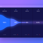
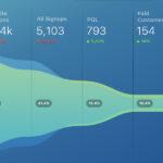
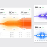
Funnel Chart
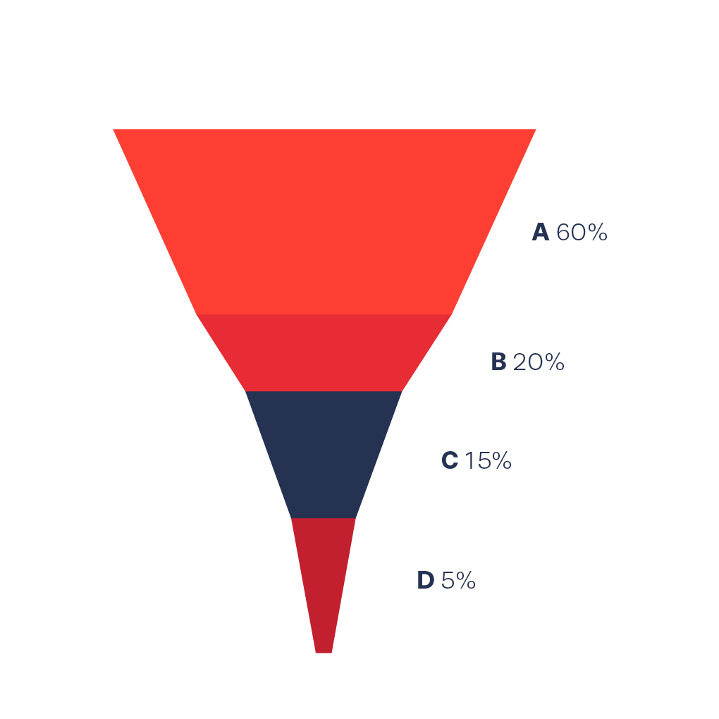
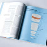
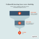
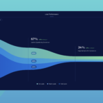
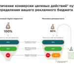
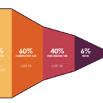
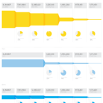
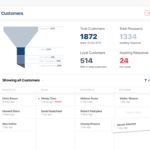
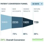
A funnel chart is used to show streamlined data; each slice in the funnel represents a process that has filtered out data. The last funnel bears the value that is the final result of the entire procedure.
A funnel chart displays values as progressively decreasing proportions amounting to 100 percent in total. The size of the area is determined by the series value as a percentage of the total of all values. Any funnel consists of the higher part called head (or base) and the lower part referred to as neck.
Ideally, the funnel chart shows a process that starts at 100% and ends with a lower percentage where it is noticeable in what stages the fall out happens and at what rate. If the chart is also combined with research data, meaning quantified measurements of just how many items are lost at each step of the sales or order fulfillment process, then the funnel chart illustrates where the biggest bottlenecks are in the process.

